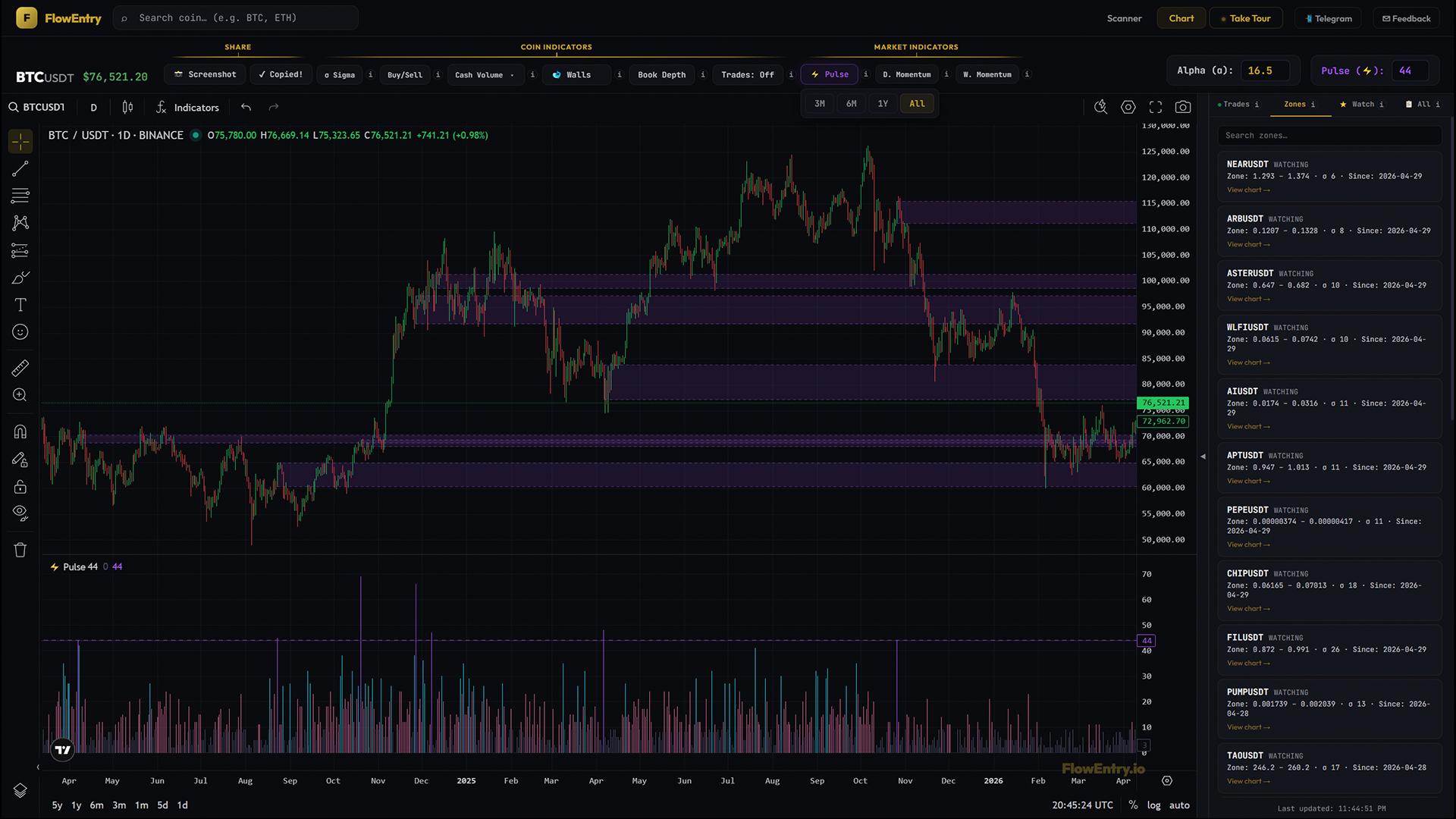
Market-Wide Indicator
Pulse
Pulse turns the whole market into one daily number: how many coins had a gold day. When the bar is purple, the market moved together.
What it answers
- “Is the whole market ripping right now, or is just one coin moving?”
- “Was that pump on my coin part of a market-wide rotation, or did it move alone?”
- “When was the last time this many coins fired at once?”
- “Is today a market day or a coin day?”
- “Where do bull-cycle starts and bear-cycle starts actually print on the calendar?”
Mental model
Pulse counts how many coins had a gold day, every day. Sigma is per-coin; Pulse is the market. One number per day, the same number on every chart you open: how many out of ~600 USDT coins fired loud enough to cross their own alpha. A purple bar means a lot of coins fired at once. Those are the days the whole market was breathing in or breathing out together. Zone-level Pulse days are when something market-wide happened, not just a coin-specific story.
Cyan, pink, and slate are the in-between intensities. Many coins fired, some, or barely any. The bar tells you what kind of day this was for the broader tape.
You don’t open thirty charts. You watch one number.
How to use it
- Read market regime at a glanceThe Pulse pane shows you, day by day, the breadth of unusual flow across the whole USDT market. Strings of purple bars mean the market is in a high-energy regime. Strings of slate mean the market is asleep. Cyan/pink fluctuations are transitional.
- Disqualify isolated movesYour coin pumped today. Pulse says slate or pink. The market wasn’t moving, your coin moved alone. Could be news, could be accumulation, could be a setup, could be exit liquidity for one whale. The interpretation changes when Pulse is cold.
- Confirm rotational movesYour coin is up 6%, Sigma is gold, Pulse is purple. The whole market is rotating. Different signal than an isolated move. Check correlated coins because the rotation is broader than your single chart.
- Date market-cycle inflection pointsThe first cluster of purple zones after weeks of slate often marks the beginning of a leg. The first cluster of purple after a long uptrend can mark distribution. Pulse dates regime changes more cleanly than any single coin’s chart can.
- Tune the threshold to your styleDefault 31 is a good general “this is loud” cutoff. Lower it (e.g. 20) to see purple zones more often. Raise it (50+) to see only major regime days. The cyan/pink tiers don’t change with the threshold; only Purple and the zones do.
- Combine with Sigma: the four casesSigma gold + Pulse purple is the highest-conviction setup. Sigma gold + Pulse cold means your coin is moving alone. Sigma gray + Pulse purple means your coin is missing the rotation. Sigma gray + Pulse cold means nothing is happening. Sit on hands.
- Focus on one regime dayA multi-year Pulse history can stack a lot of purple zones on the price pane. When you want to study one specific market-wide event in isolation, right-click that purple Pulse bar and choose “Isolate this pulse zone”. Or click the purple target icon next to the Pulse threshold to open a picker listing every pulse-qualifying day in history with date, count, and an “Only” shortcut per row. The range pill stops mattering — you can pin a regime day from years ago and view it on a 1M-range chart. A purple chip below the Market Wall Bias tag shows how many days are pinned; click the ✕ to return to “show all”. Sigma and Pulse pickers are mutually exclusive — opening one closes the other.
What it doesn’t do, and when not to use it
Pulse does not show direction. A purple Pulse day during a sell-off and a purple Pulse day during a rally both look the same. For direction, use Buy/Sell or Cash Volume on individual coins. Pulse also does not give you per-coin specifics. The “which coins” question is the Scanner’s job.
Daily timeframe and above only. Pulse is one number per UTC day. Don’t treat purple as “buy”. It means the market is loud. Pair with direction (Buy/Sell, Cash Volume) and a coin-specific signal (Sigma) before acting.
Why it works
Most “market regime” indicators are derived from a single asset (BTC dominance, total marketcap, an aggregate index). Pulse is built bottom-up: it counts how many coins independently fired their own alpha. There is no aggregate, no cap-weighting, no filtering by sector. A day where 60 small-caps fire and BTC is quiet still reads as a high-Pulse day, because that is what is happening in the market.
Examples
Case A: confirmed rotation
- Setup.
- A coin printed Sigma gold; Buy/Sell green-dominant; Pulse purple on the same day.
- Signal.
- All three reads aligning on the same day.
- Outcome.
- Trend continued for several days alongside other coins.
- Lesson.
- When Pulse confirms market-wide flow, your coin’s signal is part of a regime. Size accordingly.
Case B: lone mover (caution)
- Setup.
- A coin printed Sigma gold; Pulse cold (slate or pink).
- Signal.
- Per-coin signal without market participation.
- Outcome.
- Move faded within days, no follow-through.
- Lesson.
- Without market participation, an isolated gold day often lacks fuel. Treat as a single-coin story, not a thesis.
Case C: missed the train
- Setup.
- Pulse purple for 3 consecutive days; the coin’s Sigma stayed gray.
- Signal.
- Hot regime that never reached this coin.
- Outcome.
- Other coins ran; this coin didn’t.
- Lesson.
- If a coin can’t print Sigma gold during a hot Pulse window, it is not a leader. Rotate or wait.
Case D: dating a cycle low
- Setup.
- Pulse had been mostly slate for weeks. A cluster of purple zones printed.
- Signal.
- Breadth returned to the market in a tight window.
- Outcome.
- Market established a higher low and trended up.
- Lesson.
- First purple cluster after a long quiet stretch often marks an inflection.